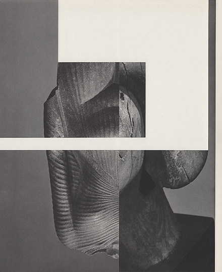
Same Same
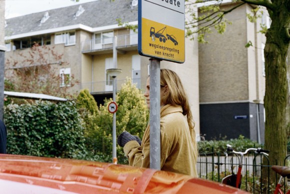
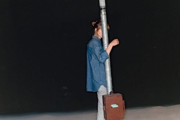
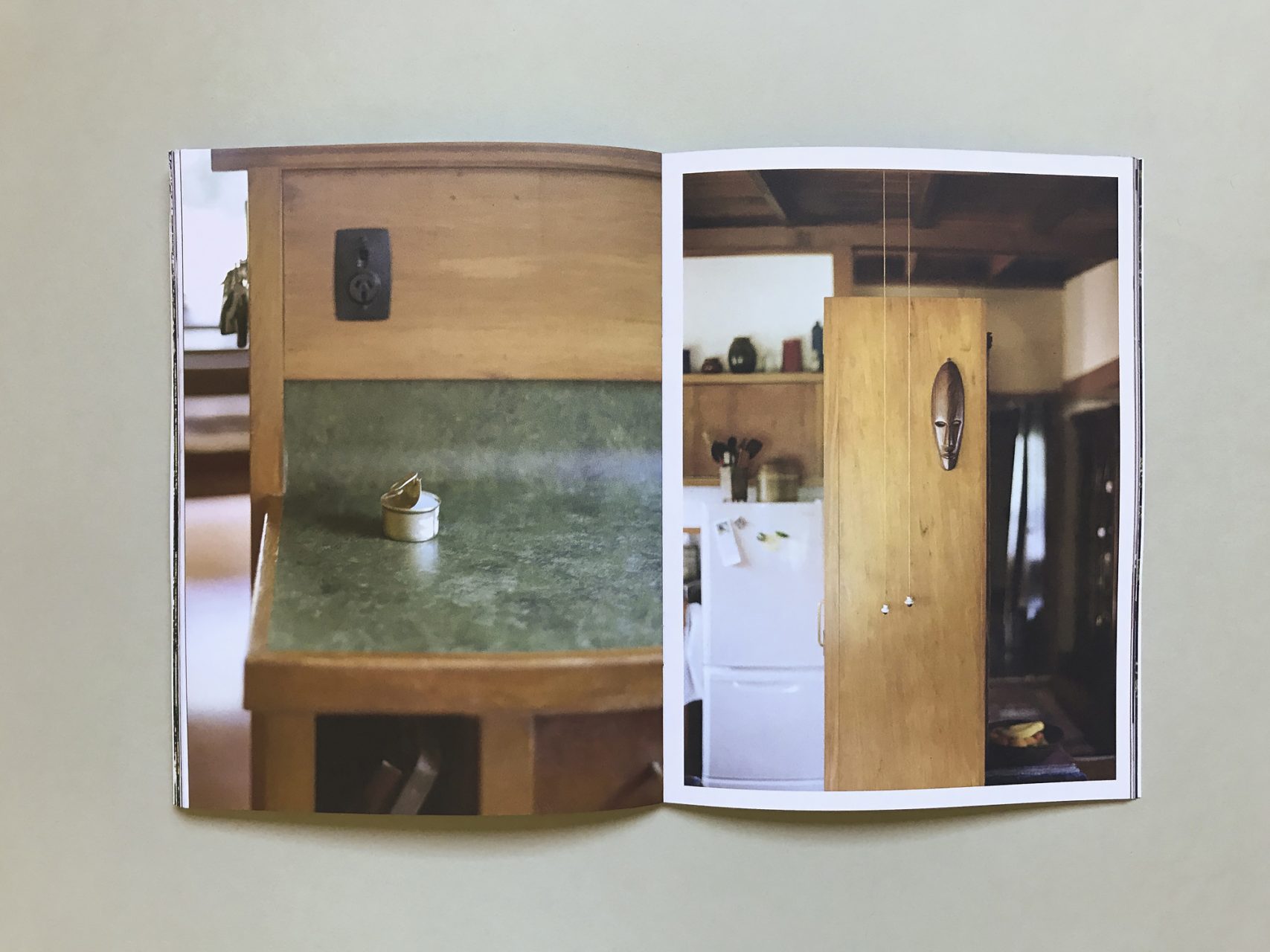
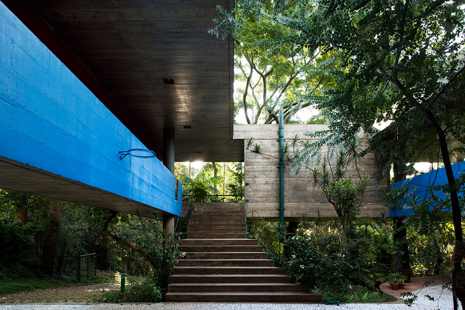
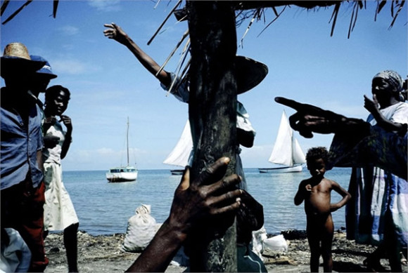
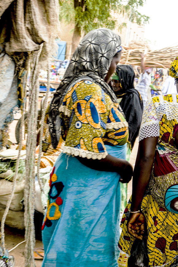
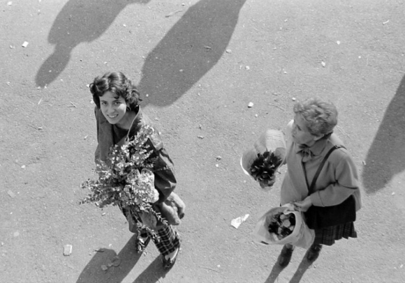
I know I’m not the only one who does this but I seem to always find images that are from completely different sources yet are similar or somewhat reminiscent of each other. This image above is from Carhartt Work In Progress Spring/Summer 2012 look book and the image below is taken by Maya Villiger from Turnedout who’s images I absolutely love. I am not in any way saying that either of these photographs are any lesser of each other, on the contrary, I love that people make similar choices about composition and design and aesthetic. It is inevitable in today’s small, possibly over saturated world, what we are all exposed to, what we take in and what we don’t. Its like a universal visual- language, and I think that is something to enjoy every now and then.

